Continuing education for public health teams
Build sharper skills for healthier communities.
Learning at a glance
Quick metrics that signal reach, pace, and credibility.
Why the new landing flow works
The redesign shifts the site from a text-heavy reference page to a guided front door with clearer hierarchy, stronger calls to action, and more confidence-building signals.
Authoritative
Accessible
Mobile-first
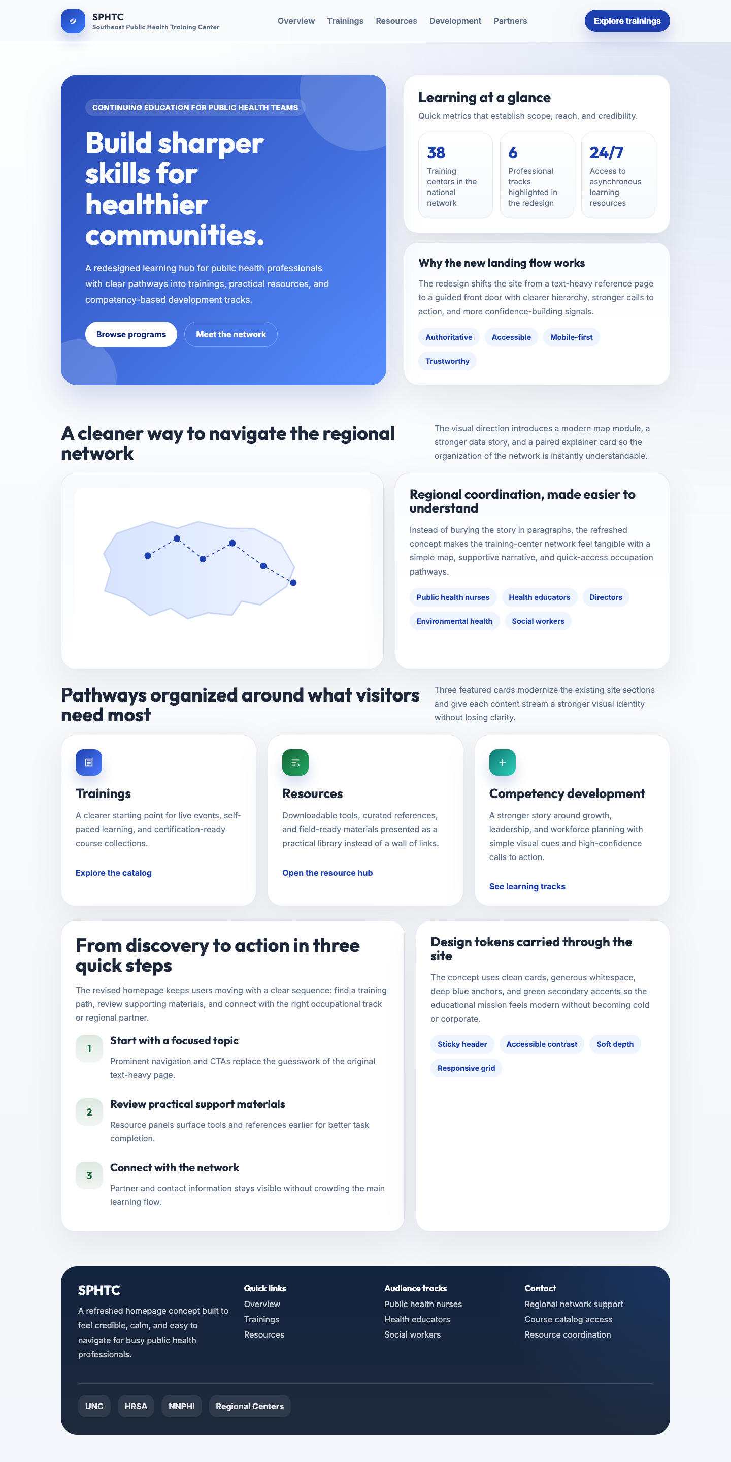
A cleaner way to navigate the regional network
The visual direction introduces a modern map module.
Regional coordination, made easier to understand
Why the regional network matters.
The information architecture now separates discovery content from deep reference material so returning visitors can reach the tools they need faster.
Pathways organized around what visitors need most
Core sections are presented as cards instead of long text lists.
Trainings
A clearer starting point for live events, self-paced learning, and certification-ready course collections.
Explore the catalogResources
Downloadable tools, curated references, and field-ready materials presented as a practical library.
Open the resource hubCompetency development
A stronger story around growth with role-based views, self-assessments, and learning recommendations.
See learning tracksFrom discovery to action in three quick steps
The revised homepage helps users move with a clear sequence.
- Start with a focused topic.Find the right entry point from the homepage without scanning the original text-heavy page.
- Review practical support materials.Resource panels surface tools and references earlier for faster task completion.
- Connect with the network.Partner and contact information stays visible without crowding the main learning flow.
Design tones carried through the site
The concept uses clean cards, generous whitespace, deep blue accents, and modern secondary accents.
Sticky header
Accessible contrast
Soft depth
Responsive grid